The thinking
Vectoral's wordmark is already a display made of lit cells. Build the product, the map and the mark from those cells, and the brand reads as monitoring before anyone reads a word.


Original. Vectoral's live hero shot: an overview with four numbers, a dotted world map with a few green points and a recent activity table in low-contrast greys, the yellow wordmark small in the corner.
Reimagined. Our redesign of the overview: each number with its trend, a map where blocked and review origins pulse, a risk score distribution, the top risk signals, and recent activity with a score bar and a verdict on every request.
The business
Sells
A detection engine that fingerprints and scores every request to a company's LLM endpoints, then flags, blocks or alerts on reseller traffic: proxies, stolen keys, harvesting scripts and wrapper services.
Who signs
Teams running paid LLM endpoints whose bill grows faster than their real users.
What's at stake
The product shot is the pitch. A buyer books a demo when the dashboard on the hero already looks like it is watching their traffic.
What the page does now
The hero shows the product: an overview with four numbers, a dotted world map with a few green points and a recent activity table, all in low-contrast greys. The yellow Thermochrome wordmark sits small in the corner, and the coloured pixel grid appears further down the page, never in the product.
What we kept
The Thermochrome wordmark and its yellow, the dark UI, their four headline numbers, their account, origin, pattern, score and verdict columns, and the coloured pixel grid from their own platform section.
What we changed
The overview, made legible.
Each number gets its trend and a word on what it means, the map shows where blocked and review traffic comes from, and a risk score chart and the top signals sit beside it, so the overview answers who is reselling before the table does.
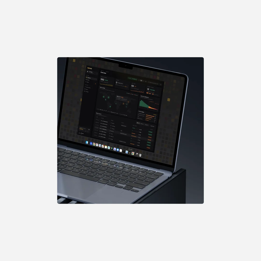
The redesigned overview on a laptop, the pixel grid behind it as the wallpaper. The map, on a departures board.
The dotted map becomes a split-flap board in an airport hall: grey cells for traffic, yellow for flagged origins, Global monitoring and a live clock across the top. It is the brand at the size of a booth or a launch film.
A departures board in an airport hall with the Vectoral wordmark, Global monitoring, Live and the time across the top, and a world map of grey cells with flagged origins glowing yellow. The mark, built from the same cells.
The wordmark glows on the pixel grid and a shield ripples out from it in lit cells, so the logo, the map and the dashboard share one material.
The yellow Vectoral wordmark glowing on the coloured pixel grid, with a shield of lit cells rippling out around it.


Our hypothesis
More demo bookings from the hero, because the product looks like it is already catching someone, and a brand that can fill a booth or a launch film without new assets.
Invented for the concept
The accounts, cities, scores, signals and chart values in the redesign are made up for the concept, as are the workspace and user names, the airport board and its date. The four headline numbers are Vectoral's own, from their hero.